How to interpret the graphs in the users page
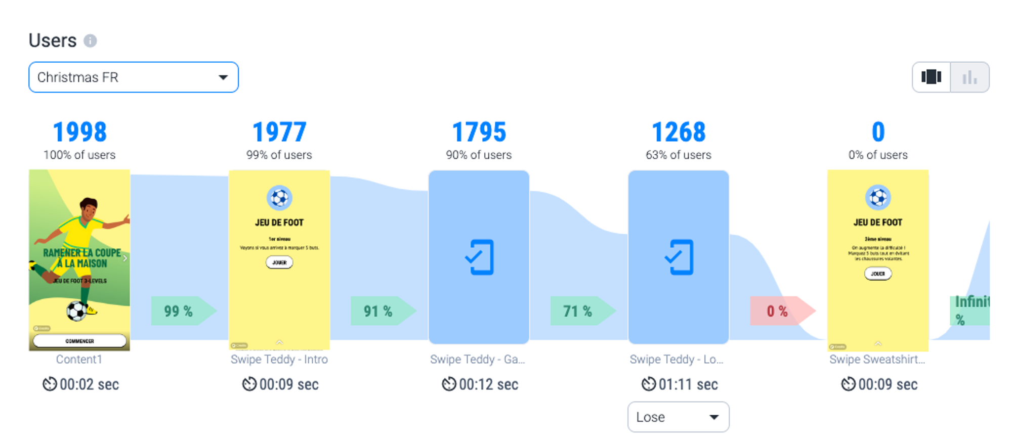
Users
On this bar graph you'll find the number of views per screen of your experience.
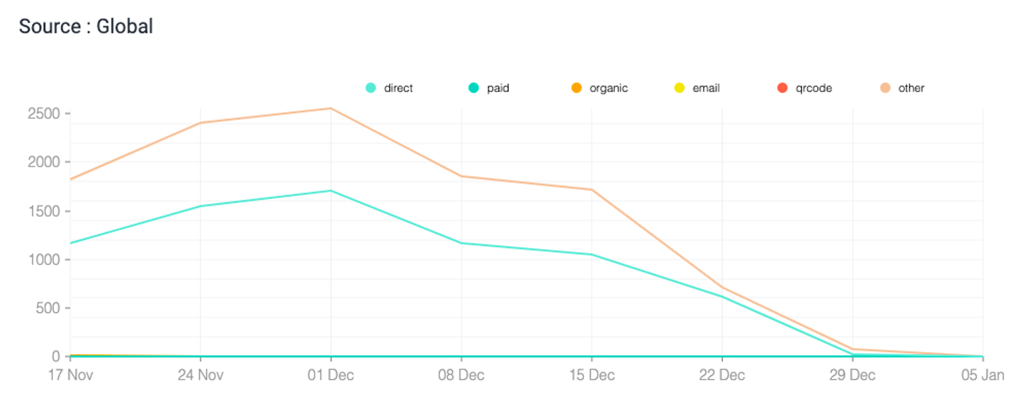
Sources
This graph allows you to determine which sources generate the most traffic on your experience. Each curve represents a source and fluctuates depending on the nuber of visits.
Users per device
Do the users landing on your experience use their mobile or computer?
.png?table=block&id=55afa4ae-4d74-4e43-a0b6-d4d660e00ffd&cache=v2)
Users per source
What are the sources generating the most traffic on your experience?
.png?table=block&id=9e87c57c-e8a3-4571-ac67-fc367f2c4448&cache=v2)
Note: Only the data with consent cookie are available.